Colour can change everything. A good colour makes your living room feel calm and inviting. A bad one makes it feel cold or too small. The right choice depends on your home, your light, and your style. Here are the trending living room colours for 2026. These are the colours people in Coimbatore and across India are loving right now. As Wikipedia explains about colour theory, colour affects how we feel in a space. So choose well.

Why Colour Matters in Your Living Room

Your living room is where your family gathers. It is where guests sit. It is often the first room people see. Living room colour ideas that work well make the space feel bigger and warmer. They also show off your furniture better. Even small changes in colour can make a big difference. And if you want professional help choosing and applying colours in your home, reach out to our team for Interiors in Coimbatore.

10 Trending Living Room Colours You Will Love

1. Sage Green

Sage green is calm and natural. It makes a room feel like the outdoors is inside. It goes well with wood furniture. It works in both small and large rooms. Pair it with cream or white for a soft, fresh look.

2. Warm Beige

Beige is timeless. But warm beige is different. It has a slight yellow or orange tone. This makes your room feel cosy and comfortable. It works with almost any furniture colour. This is one of the most popular hall colour ideas right now.

3. Navy Blue

Navy blue makes a bold statement. It gives your living room a rich, deep look. Use it on one wall – not all four. Pair it with gold or brass accessories. This creates a premium feel without spending too much.

4. Terracotta

Terracotta is earthy and warm. It comes from the colour of clay pots. It works beautifully in Indian homes. It pairs well with dark wood and rattan furniture. Add some green plants and your room will look amazing.
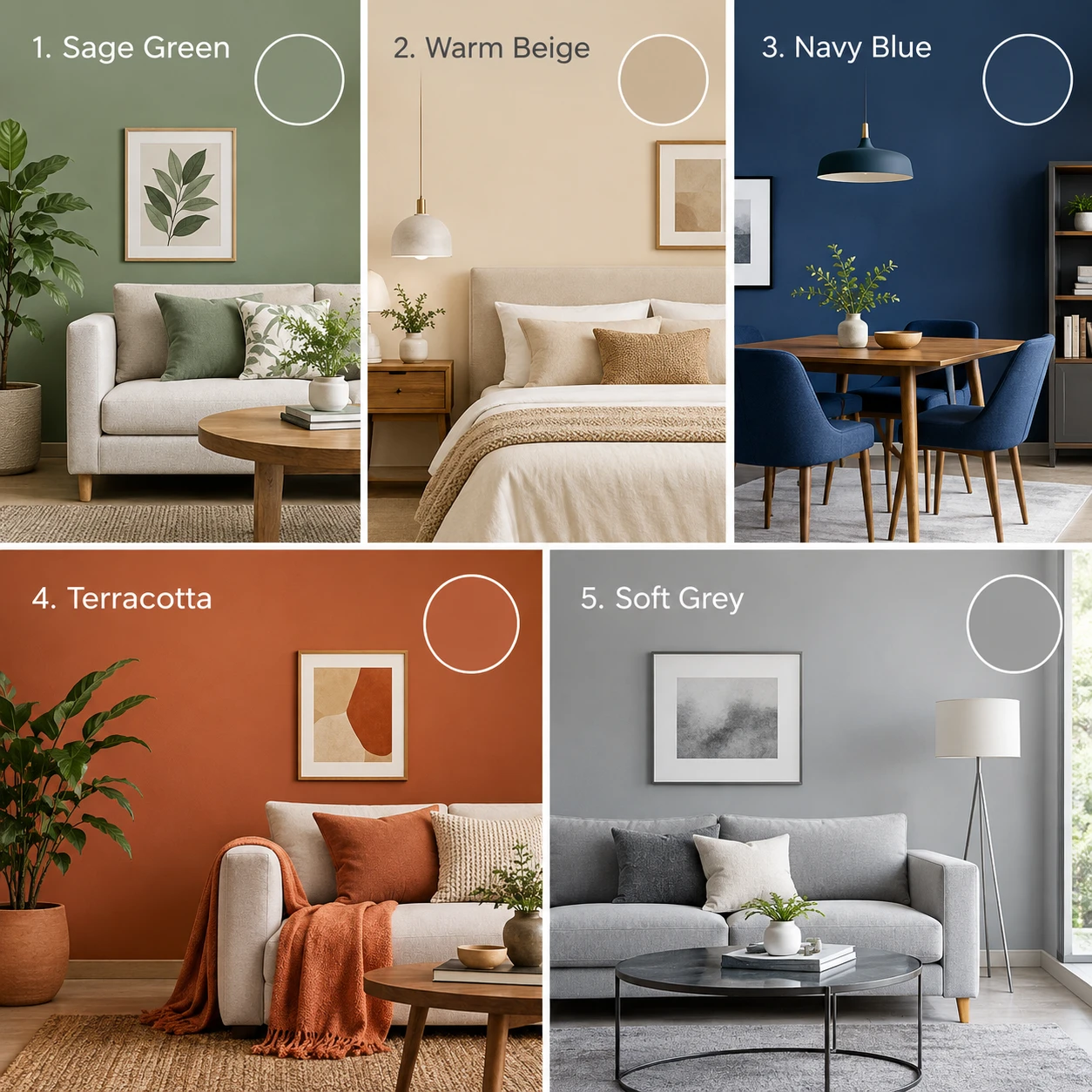
Modern interior colour palette mood board with green, terracotta, beige, and neutral shades

5. Soft Grey

Soft grey is modern and clean. It gives your room a polished look. It is not too bright and not too dark. Use a warm grey – not a cool or blue-toned grey. Warm grey makes the room feel cosy. Cool grey can feel a little cold.

6. Dusty Rose

Dusty rose is a soft, muted pink. It is not bright or loud. It feels elegant and gentle. It works well in smaller living rooms because it adds warmth without making the space feel heavy. Pair it with white or light wood tones.

7. Charcoal

Charcoal is a very dark grey. It is dramatic and bold. Use it carefully – on one feature wall or in a large, well-lit room. It pairs beautifully with white, gold, and bright colours. It gives a luxury hotel feel to your home.

8. Cream / Off-White

Cream is softer than plain white. It does not feel as stark or cold. It makes your room feel clean and open. It is the best colour for living room spaces that feel too small or too dark. Light bounces off cream walls and fills the room beautifully.

9. Forest Green

Forest green is deeper than sage. It is rich and full. It works well in rooms with plenty of natural light. It creates a dramatic but calming atmosphere. This colour is perfect if you want your living room to feel like a retreat.
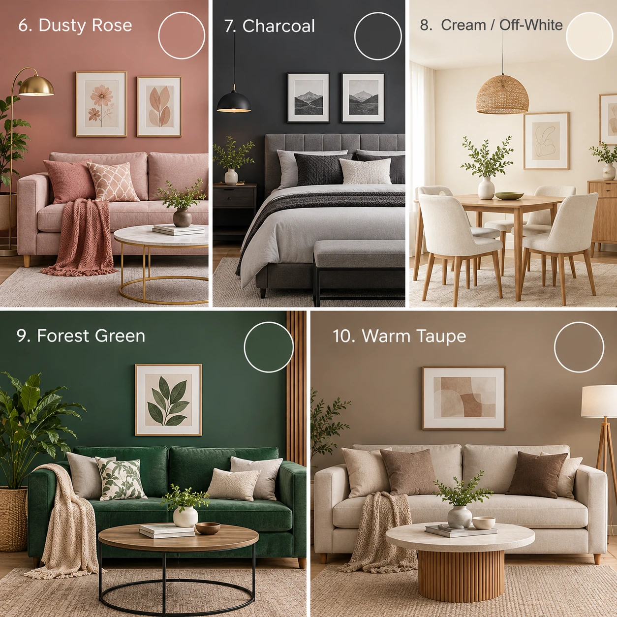
Interior colour palette ideas for a living room with green, beige, and neutral shades

10. Warm Taupe

Warm taupe sits between beige and grey. It is one of the most versatile colours available. It goes with almost any style – modern, traditional, or minimal. It is easy to live with every day. If you are unsure which colour to choose, warm taupe is a safe and stylish starting point.

How to Pick the Right Colour for Your Living Room

Choosing the right colour is not just about what looks good in a photo. Think about how much natural light your room gets. Dark rooms need lighter colours. Bright rooms can handle darker shades. Think about your furniture colour too. Your wall colour should work with your sofa, curtains, and flooring – not fight against them.

Always test a colour before you paint the full wall. Get a small tester pot. Paint a large square on your wall. Look at it in the morning light and the evening light. Colours look different at different times of day. For expert living room colour ideas and interior inspiration, explore our blog.

Conclusion

The right wardrobe should support the way a bedroom is used, not simply follow a passing trend. Bedroom Wardrobe Designs can include sliding doors or tall units. They can also include built-in storage or walk-in layouts. The best choice depends on available space, storage needs, style, and budget.

For Coimbatore homes, material selection also deserves care. Think about moisture and daily use first. Also check the available wall height and easy access. A good wardrobe plan keeps clothes organised. It can also make the bedroom feel more balanced.

Wall and All Interiors creates wardrobes that combine storage with practical bedroom planning. The aim is to make everyday spaces easier to use and comfortable to live in.

Frequently Asked Questions

Which living room colour combinations look good with wooden furniture?

Sage green with cream, terracotta with beige, and warm white with taupe are excellent combinations for wooden furniture. These shades complement the natural warmth of wood and create a balanced look. For dark wood furniture, lighter wall colours can also provide a pleasing contrast.

Which wall colour is best for a living room with a brown sofa?

Warm beige, cream, sage green, and soft greige complement a brown sofa. Cream and beige create a warm, coordinated look, while sage green adds contrast without overpowering the furniture. Choose the shade based on your floor colour and natural lighting.

How do I choose a living room colour that looks good in both daylight and LED lighting?

Test your shortlisted paint colours on a small section of the actual wall and observe them in morning daylight, afternoon sunlight, and evening LED lighting. Warm and cool light can change how a paint shade appears. Check the colour alongside your sofa, flooring, and curtains before finalising it.

Which modern living room colours are easiest to maintain in Indian homes?

Warm beige, taupe, and mid-tone earthy shades are practical options because they can be easier to live with than very dark or extremely pale colours. However, actual stain visibility depends on the paint finish, wall texture, and type of dirt. For frequently used living rooms, consider a washable interior paint finish that suits your maintenance needs.

Step into Spaces Brought to Life by

Our Expert Interior Design Solutions

Get a Free Consultation
Cost Saving
Cost Saving Design

Smart interiors in Coimbatore, that save money without sacrificing style, designs that meet your specific demands and aesthetic preferences.

Quick Customer Support
Daily Whatsapp Updates

Throughout your project, stay involved by receiving real-time updates, progress images, and design inputs straight on WhatsApp.

Premium Quality
Luxury Interiors

We create sophisticated, premium interiors in Coimbatore with well-chosen materials & designs that exude comfort, style, and classic sophistication.

Trusted by Customers
Happy Clients

We guarantee client happiness; beautiful spaces, seamless execution, and joyful smiles are the cornerstones of everything we do.

Unique Interior Concepts
Modern Design

Modern interior design that combines bright accents and clever utility to meet the demands of the future.

whatsapp-icon